library(tidyverse) # for data manipulation and plotting and so on
library(tidymodels)# for case resampling
library(devtools)  # for sourcing stuff from GitHub
library(soiltestcorr)
library(rcompanion)
library(ggridges) # to make cool distributions later
library(ggpointdensity) # to make cool points later
The Cate-Nelson (1971) is a method used to estimate the critical soil test value among a group of sites. This method does not provide a response curve, but rather displays two hard lines, one horizontal and one vertical. Sites to the left of the vertical line are generally expected see crop responses to fertilizer. These quadrant lines can be established statistically (minimizing/maximizing certain stats) or at a fixed, target Y value.
But what about the uncertainty around these line? What would it look like to calculate bootstrap confidence intervals for the critical soil test value?
My approach presented here is based on bootstrap confidence intervals, which has a tidyverse accent. You can also read about bootstraps from the nlraa package. For Cate-Nelson1 in R, the soiltestcorr and rcompanion packages are your main options.
1 Also, I might just call the Cate-Nelson “CN” at some points.
Let’s load some packages.
The Data
Let’s bring in some pseudo-fake data.
corr_data <-
  read_csv("soil-test-correlation.csv") |>
  mutate(y = y * 100) # percentage scale

plot_corr <- corr_data %>%
  ggplot(aes(x, y)) +
  geom_hline(yintercept = 100, alpha = 0.2) +
  geom_point(alpha = 0.3) +
  geom_rug(alpha = 0.5, length = unit(2, "pt")) +
  scale_x_continuous(breaks = seq(0, 300, 20)) +
  scale_y_continuous(limits = c(0, 120),
                     breaks = seq(0, 120, 10)) +
  labs(title = paste(
    "Relative yield and soil test concentration for", nrow(corr_data), "fertilizer trials"),
    y = "Relative crop yield (%)",
    x = "Soil Test (mg/kg)")

plot_corr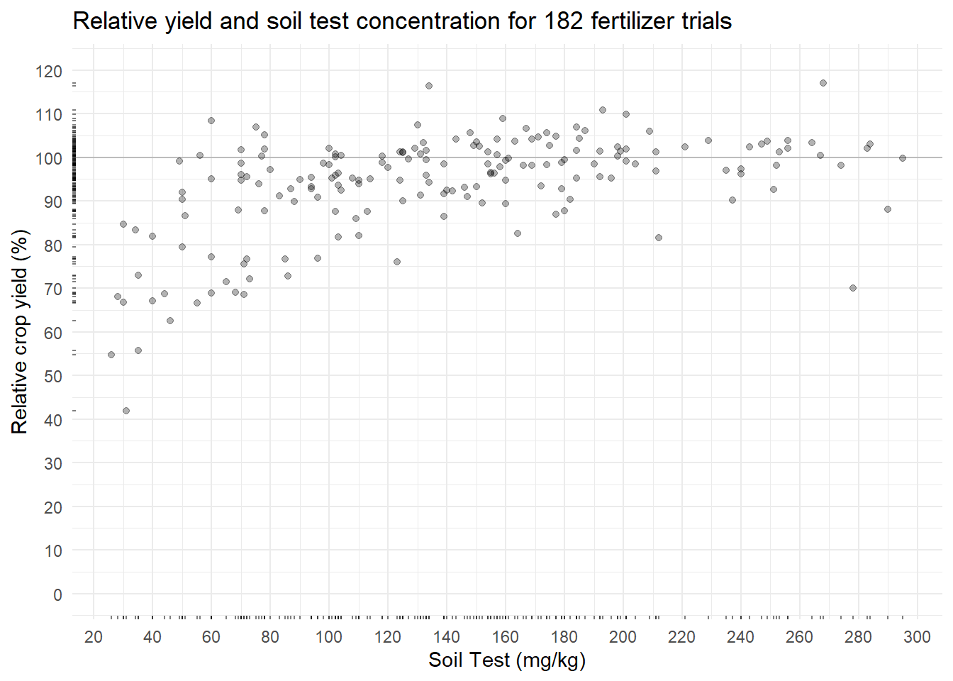
In this soil test correlation dataset, more nutrient measured in the soil should correlate to more crop yield. The relationship does not look linear (as expected) and is somewhat noisy. The Cate-Nelson procedure attempts to cut through this noise.
Doing the Cate-Nelson Once
Let’s look at the critical value by running the Cate-Nelson each way.
Fixed Y value
soiltestcorr::cate_nelson_1965(corr_data, x, y, target = 95, plot = TRUE)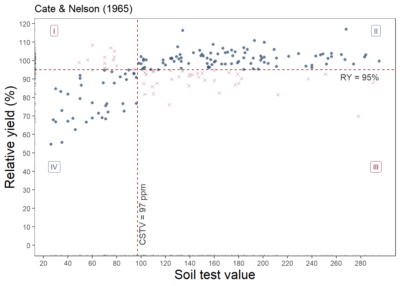
soiltestcorr::cate_nelson_1965(corr_data, x, y, target = 95)$CSTV[1] 97rcompanion::cateNelsonFixedY(corr_data$x, corr_data$y,
cly = 95, plotit = FALSE) |> head() Critx Crity Q1 Q2 Q3 Q4 Model Error N pQ1 pQ2 pQ3 pQ4 pModel pError
1 96 95 13 94 35 40 134 48 182 0.071 0.516 0.192 0.220 0.736 0.264
2 96 95 13 94 35 40 134 48 182 0.071 0.516 0.192 0.220 0.736 0.264
3 98 95 13 94 35 40 134 48 182 0.071 0.516 0.192 0.220 0.736 0.264
4 94 95 12 95 37 38 133 49 182 0.066 0.522 0.203 0.209 0.731 0.269
5 94 95 12 95 37 38 133 49 182 0.066 0.522 0.203 0.209 0.731 0.269
6 94 95 12 95 37 38 133 49 182 0.066 0.522 0.203 0.209 0.731 0.269
Fisher.p Pearson.chisq Pearson.p phi
1 2.293e-09 34.27 4.809e-09 -0.446
2 2.293e-09 34.27 4.809e-09 -0.446
3 2.293e-09 34.27 4.809e-09 -0.446
4 7.920e-09 32.49 1.197e-08 -0.435
5 7.920e-09 32.49 1.197e-08 -0.435
6 7.920e-09 32.49 1.197e-08 -0.435This approach estimated 97 mg kg-1 as the critical value to achieve 95% of the potential yield.
Free
soiltestcorr::cate_nelson_1971(corr_data, x, y, plot = TRUE)Warning in stats::chisq.test(data.frame(row.1, row.2)): Chi-squared
approximation may be incorrect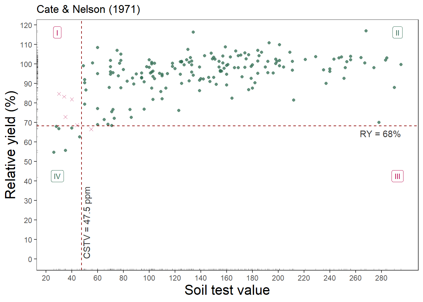
soiltestcorr::cate_nelson_1971(corr_data, x, y)$CSTVWarning in stats::chisq.test(data.frame(row.1, row.2)): Chi-squared
approximation may be incorrect[1] 47.5rcompanion::cateNelson(corr_data$x, corr_data$y, trend = "positive",
plotit = FALSE, verbose = FALSE, progress = FALSE) n CLx SS CLy Q.I Q.II Q.III Q.IV Q.Model p.Model Q.Error
1 182 47.5 8979.932 68.25 5 169 1 7 176 0.967033 6
p.Error Fisher.p.value Cramer.V
1 0.03296703 5.290161e-09 0.6991This approach estimated just 47.5 mg kg-1 as the critical value, but the relative yield is only 68%.
Doing the Cate-Nelson Over and Over: Option 1
Now to take this and put it into a framework for bootstrapping the tidy way. First, make a function that can fit the Cate-Nelson (CN) on the analysis portion of the data split created with the rsample package2. Then create the bootstraps, and fit the CN model to each. But what if a model fails? The purrr package includes possibly() which I’ve used to produce a NULL result for some reason the CN fitting fails3.
2 I sort of like adding the map(splits, analysis) step to pull out the analysis data from the split and save those resamplings in a new data column, just to prove that the data was really randomly sampled.
3 Probably won’t but I did it for the nls() functions previously.
The following is for the Cate-Nelson with a fixed RY target.
fit_cn <- function(data, target){
    cstv <- cateNelsonFixedY(
        x = data$x,
        y = data$y,
        cly = target,
        plotit = FALSE,
        trend = "positive")[1, 1]
    return(cstv)
}

# Must set seed to reproduce the same results every time
n_reps <- 1000 # sometimes denoted as "R"

set.seed(8675309)
cn_bootstraps <-
  corr_data %>%
  bootstraps(times = n_reps) %>%
  mutate(data = map(splits, analysis),
         ry = 95, # target
         cstv = map2_dbl(data, ry, possibly(fit_cn, otherwise = NULL))) |>
  select(-splits)


cn_bootstraps
# A tibble: 1,000 × 4
id data ry cstv
<chr> <list> <dbl> <dbl>
1 Bootstrap0001 <tibble [182 × 3]> 95 113
2 Bootstrap0002 <tibble [182 × 3]> 95 60
3 Bootstrap0003 <tibble [182 × 3]> 95 96
4 Bootstrap0004 <tibble [182 × 3]> 95 96
5 Bootstrap0005 <tibble [182 × 3]> 95 96
6 Bootstrap0006 <tibble [182 × 3]> 95 110
7 Bootstrap0007 <tibble [182 × 3]> 95 103
8 Bootstrap0008 <tibble [182 × 3]> 95 71
9 Bootstrap0009 <tibble [182 × 3]> 95 124
10 Bootstrap0010 <tibble [182 × 3]> 95 96
# ℹ 990 more rowsConfidence Intervals
Next, we can get a confidence interval for cstv with quantile(), which in this case is set to 90%.
ci_90 <- quantile(cn_bootstraps$cstv, c(0.05, 0.95), na.rm = TRUE) |> round()

ci_90
5% 95%
70 125 Pretty cool.
But what does it all look like?!
Visualization
What does the distribution of the critical soil test value look like?
cn_bootstraps %>%
    ggplot(aes(cstv, y = 0,
               fill = factor(after_stat(quantile)))) +
        ggridges::stat_density_ridges(
            geom = "density_ridges_gradient",
            quantile_lines = TRUE,
            quantiles = c(0.05, 0.5, 0.95)) +
        scale_color_manual(values = c("#CE1141", "#A0A0A088")) +
        scale_fill_manual(
            name = "Probability",
            values = c("#CE1141", "#A0A0A088", "#A0A0A088", "#13274F"),
            labels = c("(0, 0.05]", "(0.05, 0.5)", "(0.5, 0.95)", "(0.95, 1]")
        ) +
        scale_x_continuous(breaks = seq(40, 160, 10)) +
        labs(y = NULL, x = "Estimated Critical Value",
             title = "Bootstrap distribution with median and 90% confidence interval") +
        theme(axis.text.y = element_blank())
Picking joint bandwidth of 3.21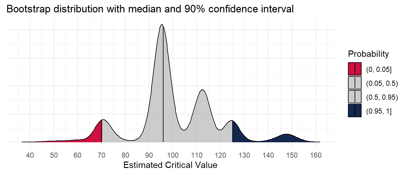
What do the estimates look like in the context of the original data?
plot_corr +
  geom_pointdensity(data = cn_bootstraps,
                    aes(cstv, ry),
                    alpha = 0.5,
                    size = 2) +
  scale_color_viridis_c(option = "H")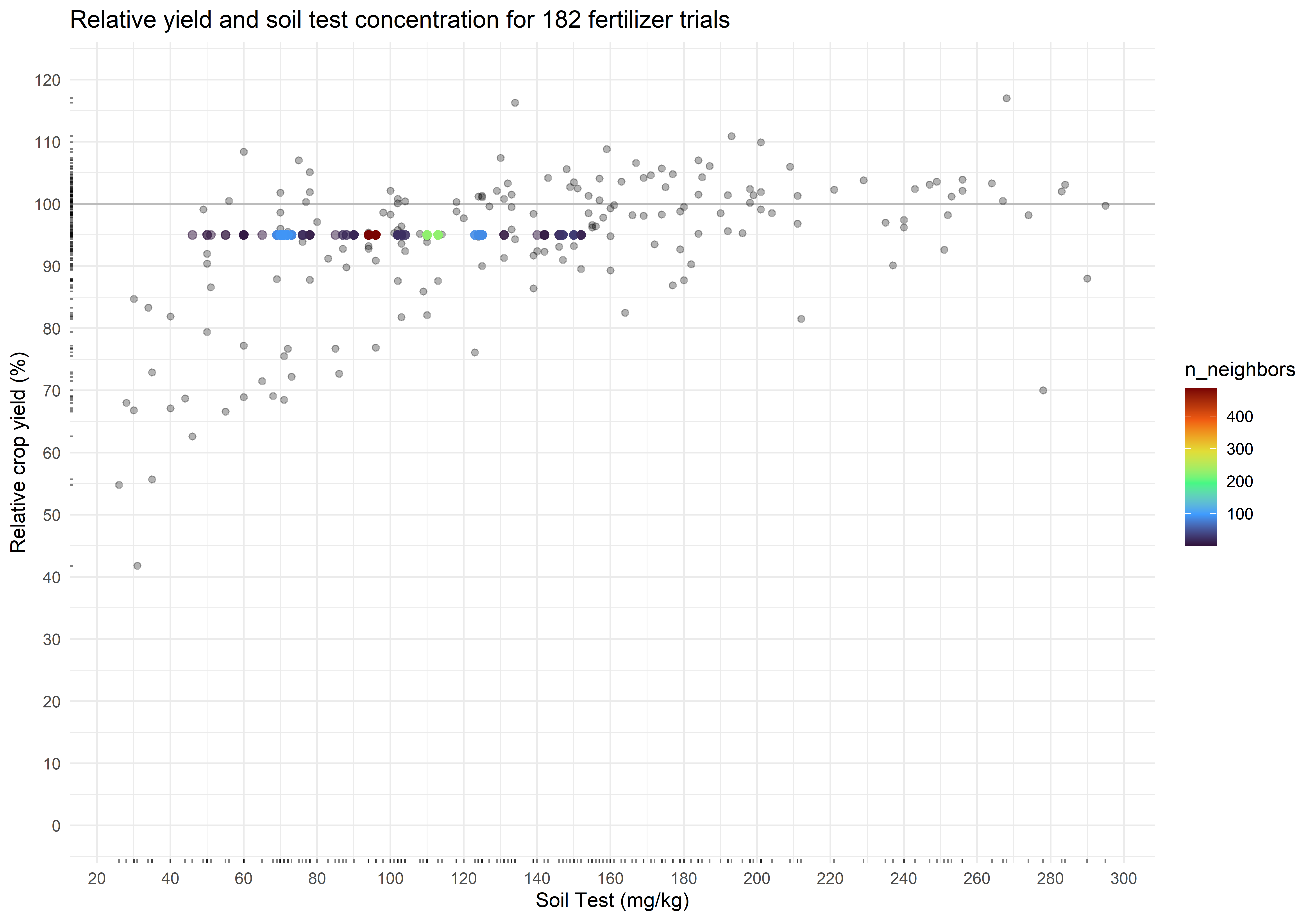
The critical soil test value for 95% RY appears to be 97 mg kg-1, and the 90% confidence interval is from 70 to 125 mg kg-1. Of concern, however, is the multimodality of the distribution. This seems to be a trait of the uncertainty around the critical value of the Cate-Nelson, at least when RY is fixed.
What if we employed the 1971 method without a fixed RY?
Doing the Cate-Nelson Over and Over: Option 2
The first thing you’ll notice is how much slower this option is because we’re allowing iterations over the Y-values in addition to the X-values. So I’m cutting the bootstraps down considerably for demonstration purposes. Also, I’m showing another option for getting out results with unnest(). Instead of getting a single numeric value for which we would map to a double
fit_cn_71 <- function(data){
    cstv <- cateNelson(
        x = data$x,
        y = data$y,
        plotit = FALSE,
        trend = "positive",
        verbose = FALSE,
        progress = FALSE)
    return(cstv)
}

cn_71_cstv <- fit_cn_71(corr_data)$CLx |> round()

# Must set seed to reproduce the same results every time
n_reps <- 100 # sometimes denoted as "R"

set.seed(8675309)
cn_bootstraps <-
  corr_data %>%
  bootstraps(times = n_reps) %>%
  mutate(data = map(splits, analysis),
         model = map(data, possibly(fit_cn_71, otherwise = NULL))) |>
  unnest(model) |>
  rename(cstv = CLx,
         ry = CLy)

mean_ry <- mean(cn_bootstraps$ry) |> round(1)
And now to reuse the previous code:
ci_90 <- quantile(cn_bootstraps$cstv, c(0.05, 0.95), na.rm = TRUE) |> round()
ci_90_ry <- quantile(cn_bootstraps$ry, c(0.05, 0.95), na.rm = TRUE) |> round(1)

ci_90
5% 95%
47 95 ci_90_ry 5% 95%
67.9 85.3 cn_bootstraps %>%
ggplot(aes(cstv, y = 0,
fill = factor(after_stat(quantile)))) +
ggridges::stat_density_ridges(
geom = "density_ridges_gradient",
quantile_lines = TRUE,
quantiles = c(0.05, 0.5, 0.95)) +
scale_color_manual(values = c("#CE1141", "#A0A0A088")) +
scale_fill_manual(
name = "Probability",
values = c("#CE1141", "#A0A0A088", "#A0A0A088", "#13274F"),
labels = c("(0, 0.05]", "(0.05, 0.5)", "(0.5, 0.95)", "(0.95, 1]")
) +
scale_x_continuous(breaks = seq(40, 160, 10)) +
labs(y = NULL, x = "Estimated Critical Value",
title = "Bootstrap distribution with median and 90% confidence interval") +
theme(axis.text.y = element_blank())Picking joint bandwidth of 5.21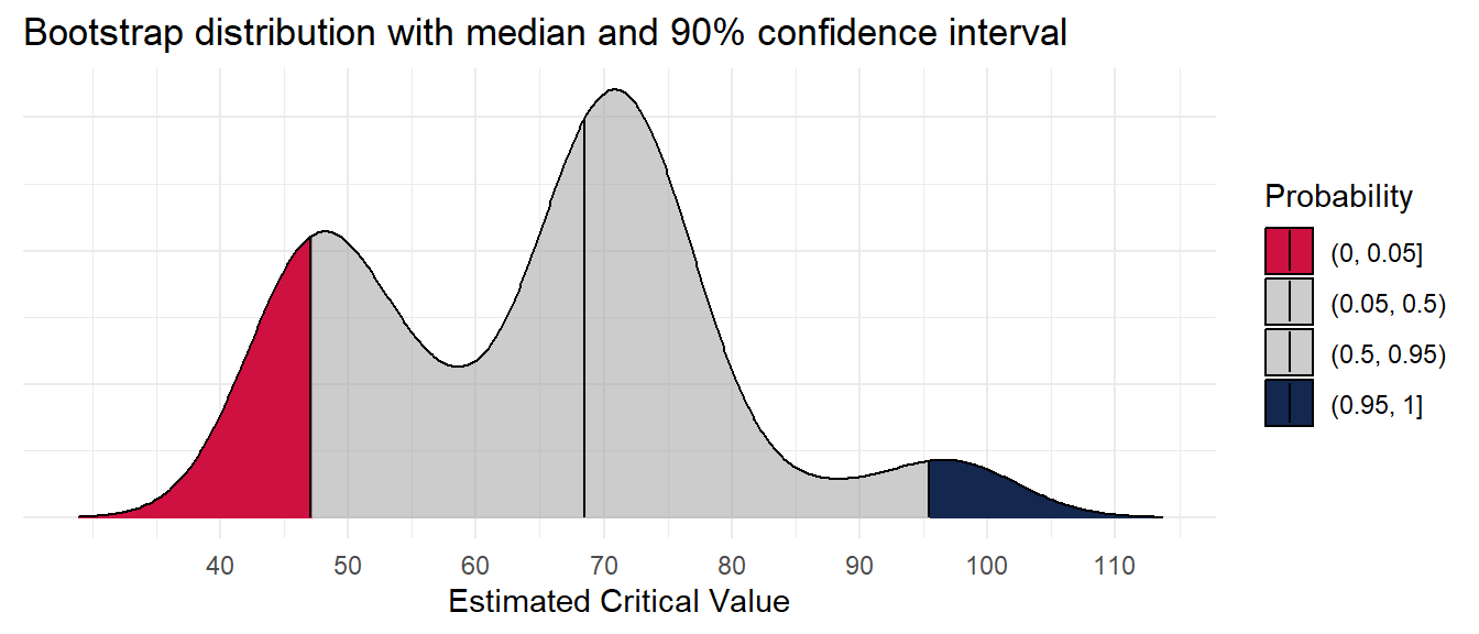
What do the estimates look like in the context of the original data?
plot_corr +
  geom_pointdensity(data = cn_bootstraps,
                    aes(cstv, ry),
                    alpha = 0.5,
                    size = 2) +
  scale_color_viridis_c(option = "H")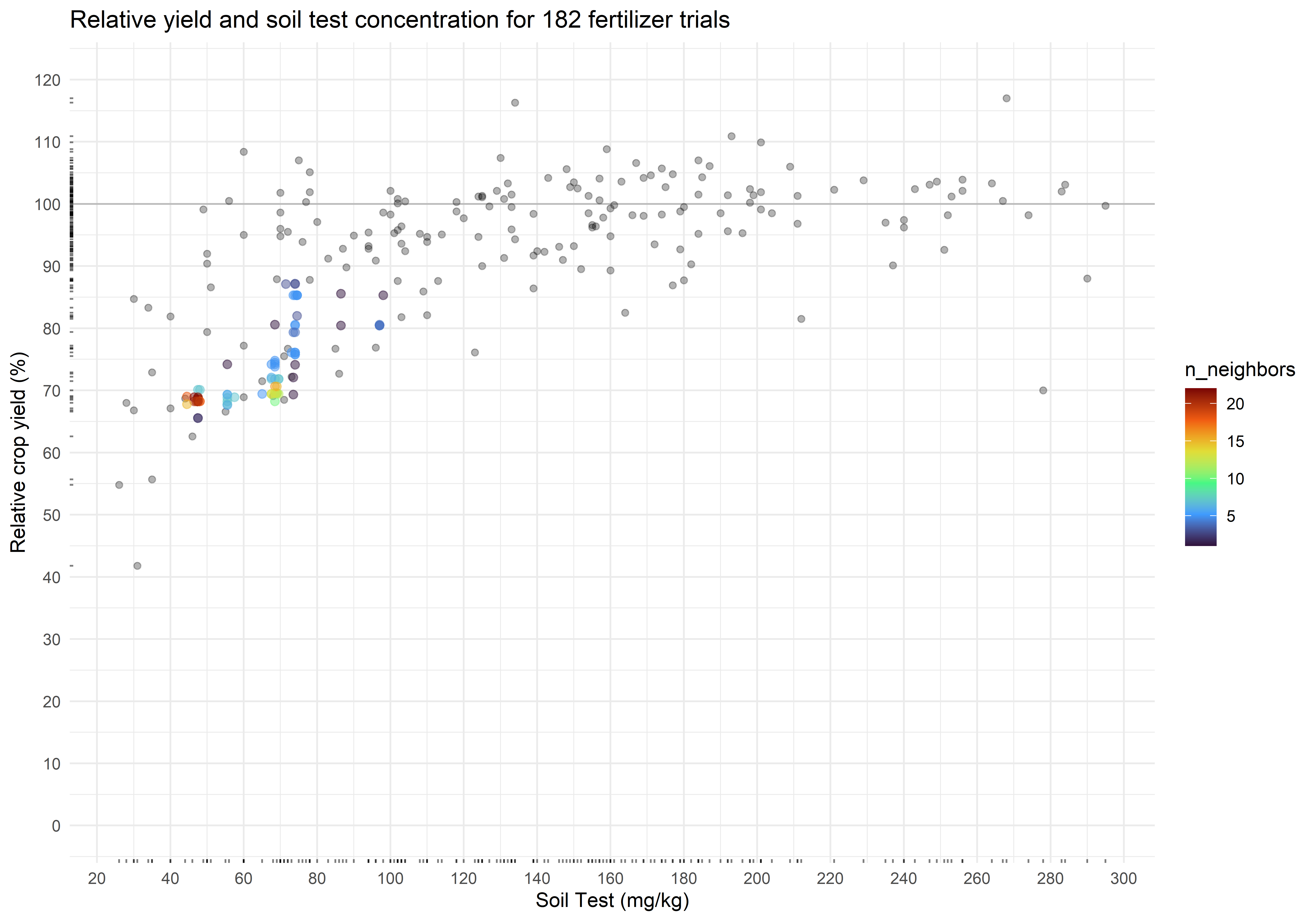
The critical soil test value is 48 mg kg-1, and the 90% confidence interval is from 47 to 95 mg kg-1. The associated relative yield with the critical values is 73.4 percent (90% CI from 67.9 to 85.3 percent). Again, check for multimodality in the distributions.
References
Cate, Robert B., and Larry A. Nelson. 1971. “A Simple Statistical Procedure for Partitioning Soil Test Correlation Data into Two Classes.” Soil Science Society of America Journal 35 (4): 658–60. https://doi.org/10.2136/sssaj1971.03615995003500040048x.