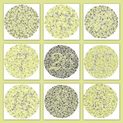
The following example is intended to help people with full-spectrum color vision experience a little bit of what it is like to be color blind.
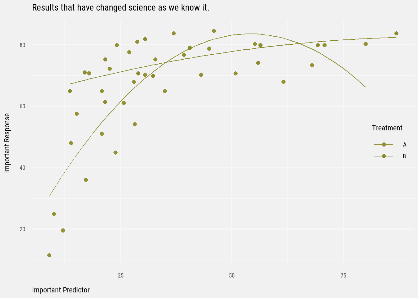
Imagine sitting in the audience at a scientific presentation, and the presenter puts up the following key result.
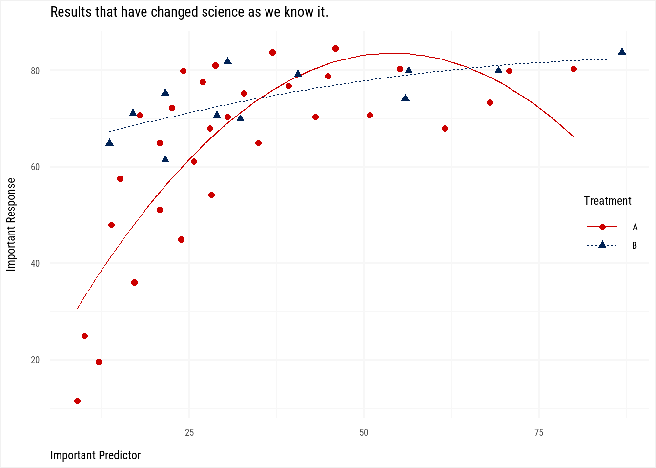
Code
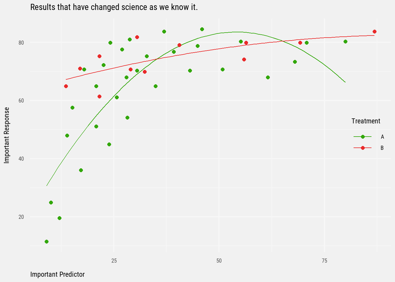
cb <-read_csv("colorblind.csv")pal <-c("#32A70A", "#E92A2A")pal_cb <-dichromat(pal, type =c("deutan"))plot <-ggplot(data = cb,aes(x = Predictor,y = Response,color = Treatment)) +geom_smooth(method ="lm",formula = y ~poly(x, 2),se =FALSE,linewidth =0.5) +geom_point(size =2) +labs(title ="Results that have changed science as we know it.",x ="Important Predictor",y ="Important Response") +scale_color_manual(values = pal) +theme_gc()plot_cb <- plot +scale_color_manual(values = pal_cb)plot_cb
“Clearly our novel treatment has vastly improved the expected response…”, the presenter says, everyone nodding in amazement.
You look at the plot again and scratch your head, a bit annoyed perhaps since the rest of the audience already sees it, but to you it’s more challenging to interpret the differences between treatments. In fact, you can’t really tell which lines belong to which treatment. Is Treatment A the line above or below Treatment B? Why can’t you readily tell the difference?
Color Blindness
Perhaps more appropriately referred to as color vision deficiency, color blindness is a condition in which certain light receptors in the eye are either deficient or absent. A deficiency in seeing reds or greens properly (red-green color blindness) affects about 8% of the male population with Northern European ancestry. The different forms can be learned about with a simple web search.
The colors of the data points in the plot shown above I intentionally altered to mimic red-green color blindness (see below). So, if you couldn’t see the difference between Treatment A and Treatment B in those data points, it’s because you were viewing the plot as one would that has red-green color blindness. Unless you’re already red-green color blind, in which case I hope you support my efforts to enlighten these “full-spectrum” people.
Emulating Vision Deficiencies
Dichromat
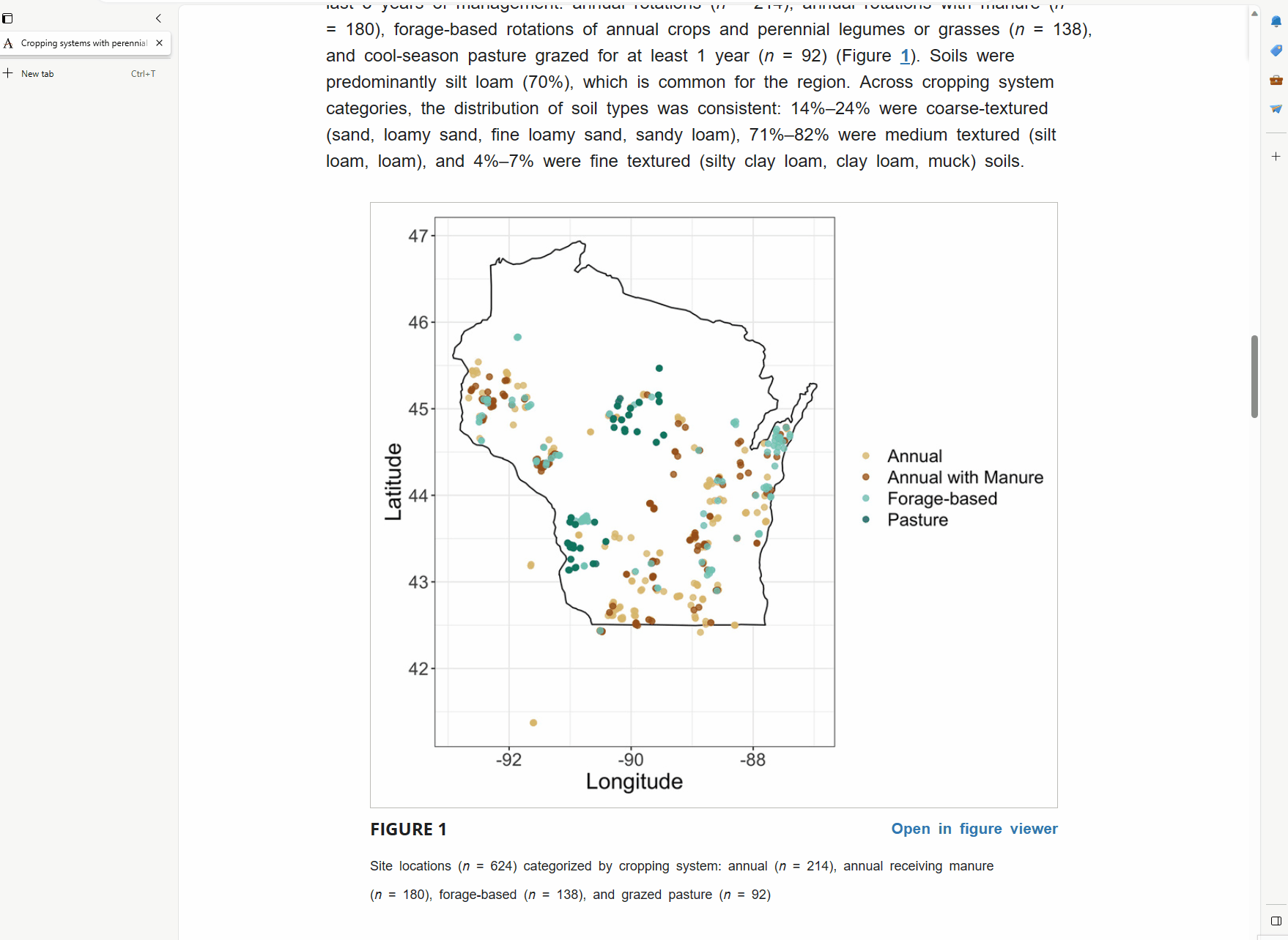
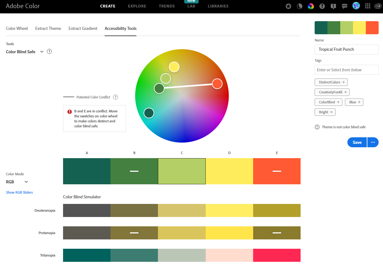
Dichromat is a package for R. To use it, create your plot with a color palette of your choice. Applying dichromat will alter the color palette, simulating one of the prominent color vision deficiencies. If the plot still looks good after using dichromat, then you can be more confident that the original color plot will be seen as intended by all audience members, and not just 92% of them.
Below is the original plot. It doesn’t pass the test.
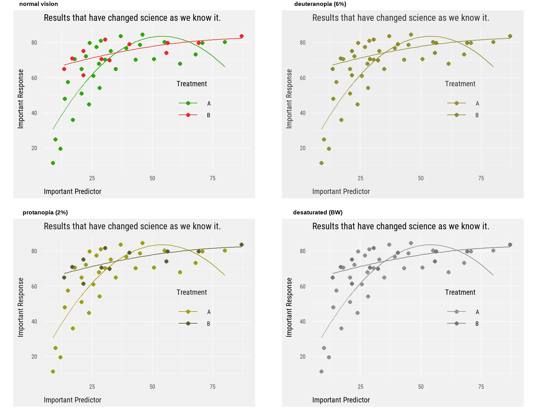
colorBlindness
colorBlindness is another useful R package that helps check a figure for accessibility, including a grayscale check1.
1 An important consideration when someone may print up your figure on a black and white printer.
Code
colorBlindness::cvdPlot(plot)
Internet Browser + F12
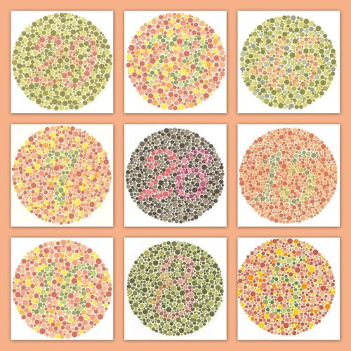
Simulating color blindness in a desktop web browser can be done with Developer Tools (F12). There used to a browser extension called NoCoffee, that could change the colors on your web page and simulate color blindness. Once installed, you could simply navigate to a webpage or web image that you would like to see as one with color blindness would, and turn on one of the color deficiency options such as “Deuteranopia”. The images below are an example of using that extension2. If you have “normal” vision, notice how the numbers in the red-green swatches disappear under the “Deuteranopia” setting (right).
2 Like 7 years ago!
Interestingly, a person I shared this with (who is red-green color blind) said they could actually see some of the numbers in the image on the right. This supports the important fact that those with color vision deficiencies can detect contrast or color brightness pretty well.
There is a techy way to emulate vision deficiencies: the F12 key.
Separate data into small multiples, like these maps also by John Nelson
And…keep searching around. Others have found good color combinations and so forth.
For example, some researchers developed color maps for oceanography but with the goal that the range of colors would be perceptually uniform and based strongly on lightness. As a result, the color maps are beautiful and relatively friendly to the color blind, an audience these researchers deliberately considered.
The following is a simple modification of the original plot, which involves shapes and limits the palette to changes in brightness rather than colors.
Code
ggplot(data = cb,aes(x = Predictor,y = Response,color = Treatment)) +geom_smooth(aes(linetype = Treatment),method ="lm",formula = y ~poly(x, 2),se =FALSE,linewidth =0.5) +geom_point(aes(shape = Treatment),size =2) +scale_color_manual(values =c("#CC0000", "#002255")) +labs(title ="Results that have changed science as we know it.",x ="Important Predictor",y ="Important Response") +theme_gc(fill_gray =FALSE)